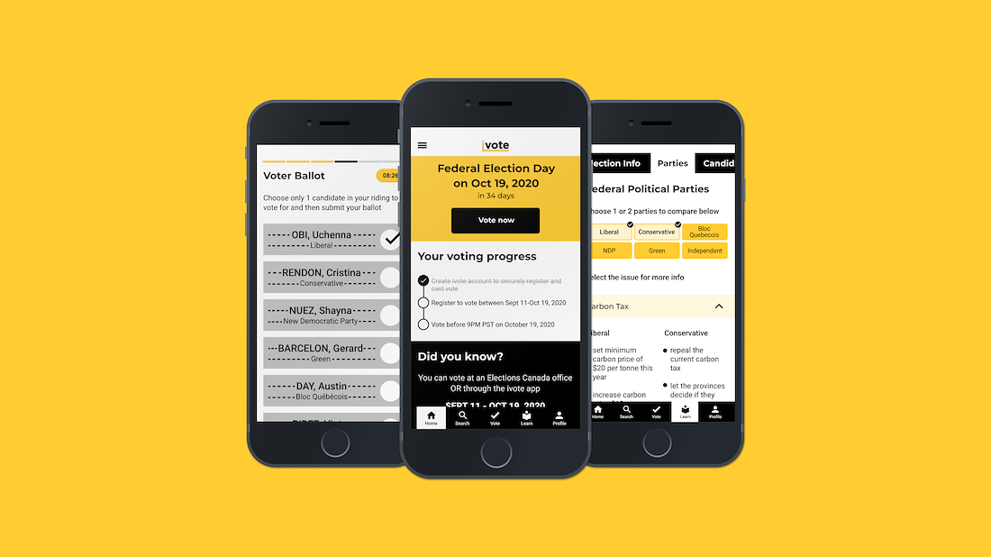
ivote
UX Design — UI Design — Art Direction
— CLIENT
Canada Elections
— MY ROLES
UX Designer
UI Designer
Art Director
— TIMELINE
4.5 months
Nov 2019-Mar 2020
— TOOLS
Figma
InVision
Adobe Illustrator
Adobe Photoshop
Principle
ivote is a blockchain-based electronic voting app targeted at voters who want to:
1) easily educate themselves about the federal election, candidates, and parties, and;
2) who want to vote in a secure, transparent, and convenient way.
This product was designed to be a Software as a Service (SaaS) company in partnership with Canada Elections as the fictitious client.
Vote Flow
Education Flow
PROBLEM
Canadian voter turnout hovers around 66% for 2019. According to Statistics Canada, the top two reasons why electors didn’t vote in the 2019 Canadian election were:
- 1) Everyday life or health reasons
- too busy, out of town, illness or disability
- 2) Political reasons
- lack of information, choices available, confusion, uninterested
So, how might we increase Canadian federal voter turnout?
PROCESS
I approached this complex and impactful problem with double diamond framework of discover, define, develop, deliver to both do the right things and do things right.

DISCOVER – RESEARCH PHASE

RESEARCH FOCUS
1.
- What are people’s experiences with the current national paper-based system?
2.
- How might we increase overall Canadian federal voter turnout to reflect democratic values?
3.
How might we ensure secrecy, security, and voter trust via electronic voting?
USER PROFILES
I compiled the data from the eight user interviews into digestible user profiles that highlighted demographic info, what was important to them, and how they voted.
AFFINITY DIAGRAMS
I conducted two affinity diagram sessions with three participants to categorize and prioritize 168 data points from user interviews.
INTERVIEW DATA ANALYSIS
Assumptions validated through the interviews:
- ½ Voters want to be able to vote from anywhere at anytime and not have to physically go to a polling station to vote
- ✔ Voters want to make sure their vote is secret and valid
- ✔ Voters want to feel informed about the parties they vote for
- ✔ Voters want the most efficient and convenient way possible to vote
- X Voters don’t want to spend a lot of taxpayer money on elections
- ½ Voters don’t feel like their vote counts, which results in lower voter turnout


DEFINE – SYNTHESIS PHASE
USER EXPERIENCE MAP
To better understand the overall feelings, behaviour, touchpoints, and thinking of Canadian voters, I amalgamated the data collected into a User Experience Map.
Top areas for an improved experience were:
1) Registration
2) Education
3) Voting

VOTER ARCHETYPES + JTBD
Based on the top concerns found through the user research, two voter archetypes and their Jobs to be Done (JTBD) informed the priorities of the app design:
- 1) GREG, THE BUSY VOTER
- "As a busy voter, I want voting to be as convenient and efficient as possible, so that I can get back to my busy day”
- 2) SUZI, THE UNINFORMED VOTER
- “As an uninformed voter, I want to be able to quickly and conveniently educate myself on who I should vote for, so that I can easily make a decision and actually vote”

USER JOURNEY MAPS
To better understand each user archetype, I created User Journey Maps to outline Greg and Suzi’s goals, touchpoints, thoughts, emotions, and ideas to improve their voting experience.
The top opportunities for an improved experience for Greg were registration and voting, while for Suzi they were education and decision making.


MENTAL MODEL
- I dug a little deeper and used a mental model to highlight how users interviewed may think and behave in each of the stages of the voting process.
- I evaluated each of the cards to see where there may be opportunities to address some of the behaviours and thoughts with How Might We questions.
The overall opportunities for ivote, based on the research conducted were:
- 1) Mobile + paper voting combo
- 2) Improved registration
- 3) Platform + candidate education
- 4) E2E encryption / blockchain technology

DEVELOP – IDEATION PHASE
USER FLOWS
- From all of the research and data synthesized, I outlined and iterated on user flows for each voter archetype.


SKETCHES
- I evaluated 40+ apps for inspiration, best practices, and language, drew sketches and conducted usability tests with a rapid paper prototype.

WIREFRAMES
With results from the rapid paper prototype tests, I created wireframes in Figma and an interactive prototype in InVision for home screens, the vote flow, and the learn flow.

DELIVER – IMPLEMENTATION PHASE
USABILITY TESTING
- I focused heavily on testing and iterations to remove kinks in the user experience.
- — 30 usability tests and feedback performed
- — 9 participants tested (6 Canadian + 3 Non-Canadian)
- — 14 iterations of ivote
One of the biggest pieces of feedback from learn screens testing and iterations was the way in which information was presented. I initially sketched out ways in which data visualization could make complex information more digestible. But, users noted that too much data visualization could be misinterpreted, especially when the stakes of an election are high.
It was also important to users that learn screen iterations allowed for the ability to toggle between parties and political issues and vote directly from each issue or candidate.

DESIGN RATIONALE
Five key considerations helped me to arrive at the final design solution:
1) Defining scope
Initially, I wanted to do all the things; app, web, wearables, you name it. But, with a four month timeline, it's not always possible to solve the world's problems in one go. ;)
So, I sought out input and recommendations from instructors and mentors and opted to focus on a minimum viable product of a mobile app.
I also took into account that not all Canadians have the latest iPhone, so the design needed to work for older iPhone generations, as well.
Vote Flow
Education Flow
2) Designing for Blockchain
This was my first time designing specifically for blockchain technology. I considered a number of questions:
— Are there particular technical processes to understand and follow?
— What information does a user need to know?
— How much is too much information for blockchain newbies?
So, to ensure that what I was designing was technically feasible, yet not overwhelming to the user, I read articles, reviewed blockchain-based apps, and spoke with a software developer with blockchain experience.

3) Communicating security and trust
Not everyone is stoked about electronic federal voting. Questions constantly arose: Is it safe? Is it secure? How do I know my vote was counted? How do I keep my vote anonymous? How does the app make sure voters get only one vote?
The cornerstones of an election are legitimacy, security, trust, anonymity, and non-partisanship. So, I designed a value-based onboarding flow before signup to reassure and educate users of the app's purpose and manage expectations.
The ballot also mimics the current ballot design to address security, trust, and continuity with the paper-based design (which the app would be used alongside).

4) Presenting unbiased and organized content
It was of utmost importance as a designer, to voters, and Canadian electoral law to ensure that the design of ivote was unbiased.
This included not only colour and art direction, but also the ordering of candidates and parties to ensure that there were no implicit biases. After exploring a few different options such as alphabetization and randomized ordering, I chose to list candidates and parties in the order of current parliament standings.
An unexpected surprise during the design process was how much of a focus on content and UX writing this project was. It was an interesting challenge to communicate important and sometimes complex information in a clear and succinct way with minimal button clicks as possible.


5) Awareness of multiple states
ivote was designed with four specific user states of not registered to vote, registered to vote, not voted, voted.
Not all voters would come to the app at the same stage. Some users may have voted in a previous election and may already be registered on the List of Electors, some users may have never registered before, some users may be returning to vote after registering and learning about candidates at an early time.
Canadian federal elections periods are time-bound (every four years) and not indefinite, like most app uses. I considered that ivote would have different states based on Election stages (pre-election, election opens, election closed, post-election, off-season), and focused on the open election period.

RESULTS
The common sentiment from users that I interviewed and folks that I shared the app with was of surprise that this federal voting technology doesn't already exist. Remarks like "I wish this existed" and "I would totally use this" indicated the importance of exploring this product design.
ivote won awards for Best UX Design, Best Interaction Design, and Best Graduate Project at Vancouver Film School (VFS).
NEXT STEPS
This quickly became a passion project of mine because of the wide social and political impact that it could have. Things that I would have liked to explore deeper:
1) Design the election worker backend of the app, including dashboard management, poll worker management, news communication, etc.
2) Design voting results with beautiful data visualization
3) Research and implement design specifically for constraints related to accessibility, lack of mobile phone, housing insecurity
CREDITS
Special thanks to Adam Finley, Gerard Barcelon, Uchenna Obi, Anthony Morris, Bradley Smith, Dougal Muir, Ainara Sainz, Henry Chu, and Christopher Quine for providing valuable mentorship and feedback throughout this project.
Neither Elections Canada nor any of the Canadian federal political parties were involved in this project.